
"How can we untangle a complex navigation system to help users find what they need, faster?"
BackMarket IA Redesign
Restructuring navigation for a leading refurbished electronics marketplace to enhance usability and content clarity.
The Challenge: A Tangled Web
BackMarket's mission to promote tech reuse was hindered by confusing navigation. Goal: redesign for intuitive, clear user experience.
Context & Goals
BackMarket is an online marketplace for refurbished electronic devices, categorized into “fair,” “good,” and “great” condition. The company’s mission is to promote the reuse of technology to reduce electronic waste.
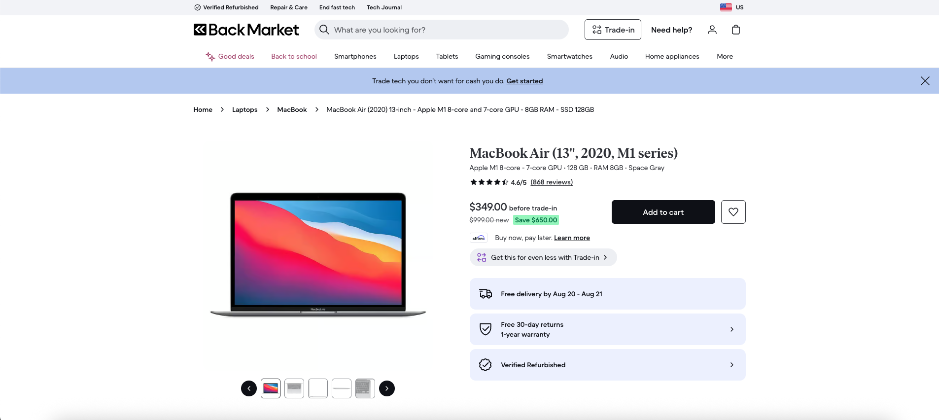
This project aimed to redesign BackMarket’s navigation to improve its usability and clarity. The primary challenge was a disorganized hybrid navigation system with three separate navbars featuring overlapping and poorly grouped categories.
Understanding the User Journey
To fix the navigation, we needed to understand how users were getting lost. Deep dive into content and usability testing revealed key insights.
Content Inventory & Audit
Started with thorough content inventory. Reduced 60 subheaders to 45 by eliminating redundancy and grouping similar topics. Navigation audit revealed significant overlap and inconsistency across three navbars.
Initial Findings
Audit revealed redundant headers and confusing pathways (e.g., 'Laptops' appearing in multiple places).
The Core Problem
Hybrid navigation lacked consistent logic, making it difficult for users to form a mental model of site structure.
Usability Testing
Multi-faceted testing approach identified pain points and validated design decisions. Included card sorting, treejack testing, and first-click testing.
Card Sorting
Open card sort with 27 items revealed users' mental models for content grouping. 18/27 cards sorted as expected.
Treejack Testing
Two rounds of testing showed significant improvement, from 67% to 87% success, after we clarified task wording and allowed exploration.
First Click Testing
Achieved an 87% success rate overall. A confusing 'Start Now' button for trade-ins was identified as a key area for improvement.
Crafting a Coherent Structure
Research insights informed a new, streamlined information architecture with wireframes to bring it to life.
The New Sitemap
New sitemap uses hybrid organization: topical for main categories, alphabetical for brands, chronological for product versions. Eliminated 'More' category and redistributed content. Reduced subheaders from 60 to 45.
Before
- Original Sitemap
- Trade-in your tech
- Mother's Day Deals
- Smartphones
- Laptops
- Tablets
- Gaming Consoles
- Smartwatches
- Audio
- More
After
- BackMarket Sitemap
- Smartphones
- Gaming Consoles
- Computers & Tablets
- Smartwatches
- Audio
- Deals
- Services
- Tech Guides & Articles
- Setups
Mid-Fi Wireframes
Mid-fidelity wireframes model two key user journeys: purchasing refurbished devices and trading in devices for payment. Foundation for redesigned IA and UX improvements.
Refurbished Device Purchase Flow
Browsing to order completion for purchasing refurbished devices.

Home Page
Product Discovery
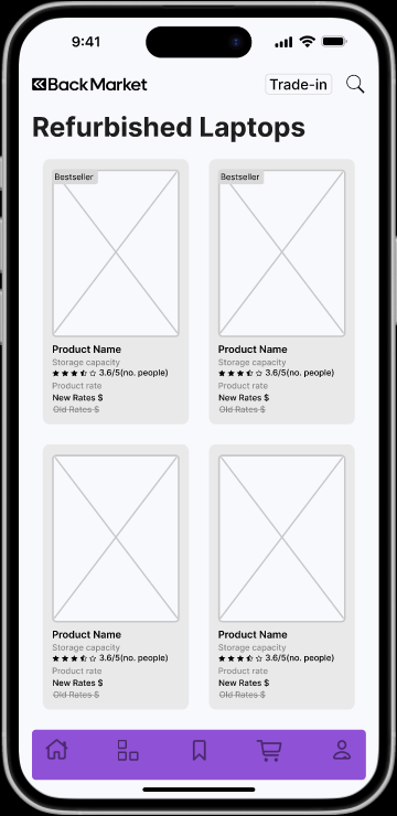
Refurbished Category
Product Browsing
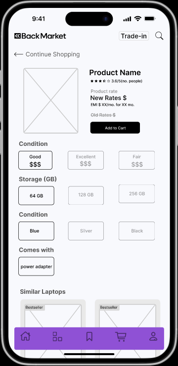
Product Details
Product Information
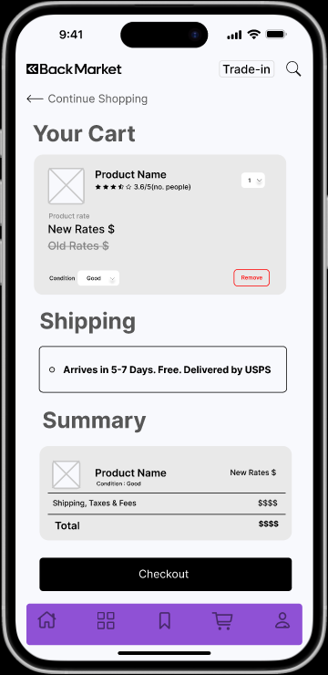
Shopping Cart
Order Review
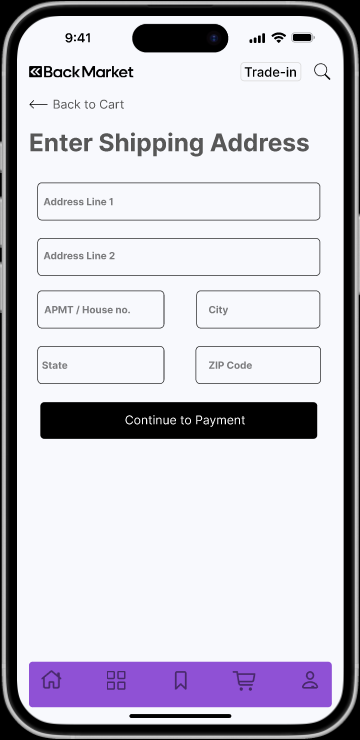
Address Information
Shipping Details
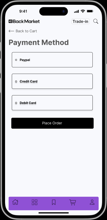
Payment Method
Payment Processing
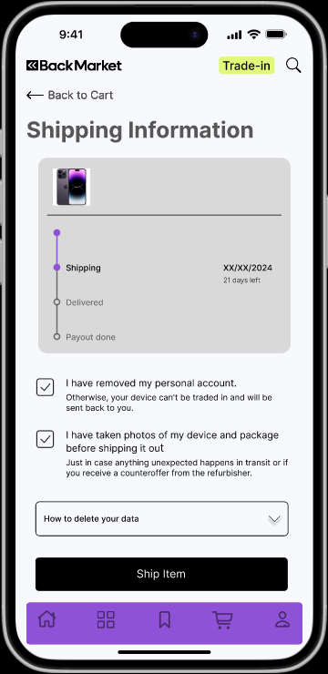
Shipping Options
Delivery Preferences
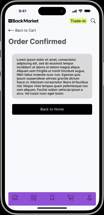
Order Confirmation
Purchase Complete
Trade-in Flow
Trading in devices to receive payment.

Home Page
Trade-in Entry Point
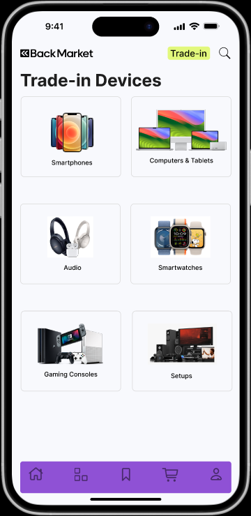
Trade-in Start
Device Selection
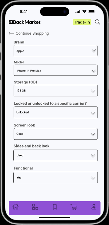
Device Assessment
Condition Evaluation
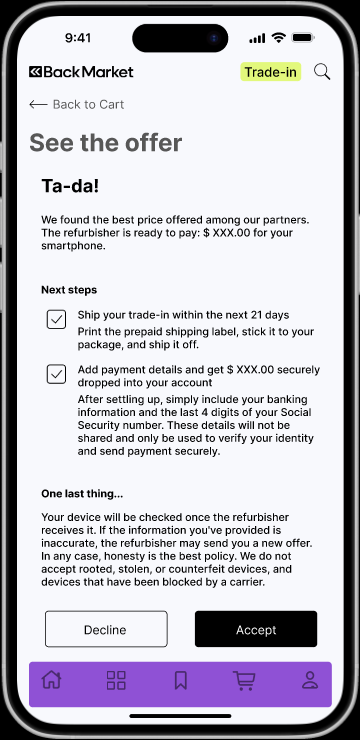
Trade-in Offer
Value Proposition
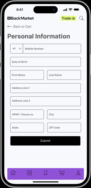
User Information
Contact Details
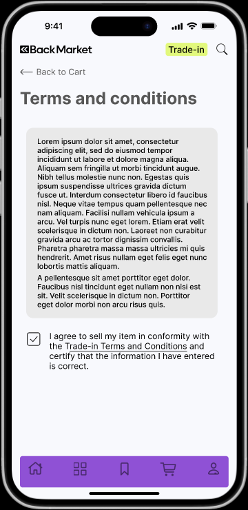
Terms & Conditions
Agreement
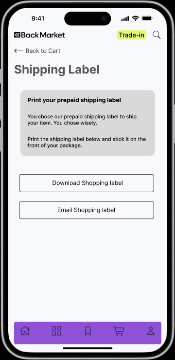
Shipping Label
Label Generation

Shipping Arrangement
Pickup Details

Trade-in Complete
Process Finished
Reflection & Next Steps
Project success with room for improvement. Key takeaways and future considerations.
Key Insights
- Clearer task phrasing dramatically impacts success rates.
- Allowing users to explore boosts their confidence and success.
- Ambiguity in product categorization is a major source of friction.
Next Steps
- Broaden test demographics to include less tech-savvy users.
- A/B test alternative navigation schemes to further optimize.
- Integrate accessibility improvements based on WCAG guidelines.
- Examine the impact of microcopy and call-to-action clarity.
"Well-intentioned features fail without solid information architecture foundations."